Running a website on WordPress and not making it mobile-friendly is like trying to talk to someone with a blurry phone screen, frustrating and sure to lose attention. A lot of people don’t realize how important it is to make a WordPress site responsive, because if your page doesn’t look good on a phone, visitors will just bounce away. That’s where a good WordPress website responsive plugin can help. It’s like giving your site a quick makeover that adjusts everything perfectly for any screen size. With so many options out there, choosing the right plugin can seem confusing, but it doesn’t have to be.
To make your website both visually appealing and easy to navigate on any device, using a dynamic website design templates is key. These templates are built to adapt seamlessly to different screen sizes, ensuring a smooth user experience on desktops, tablets, and smartphones. By choosing a responsive, flexible template, you not only enhance usability but also improve engagement, reduce bounce rates, and increase traffic. Investing in a high-quality dynamic template helps your online presence grow faster while keeping your site modern, professional, and fully mobile-friendly.
How to Choose the Right WordPress Website Responsive Plugin for Your Needs?
Choosing the right WordPress website responsive plugin is crucial for ensuring your site performs well on all devices and meets your specific needs. With so many options available, it's important to evaluate each plugin based on key criteria to make an informed decision.
- Identify Your Website Goals: Determine what you want to achieve with your site, such as improving speed, enhancing design, or adding eCommerce features. This helps narrow down plugin choices to those that best support your objectives.
- Check Compatibility: Ensure the plugin is compatible with your current WordPress version, theme, and other installed plugins. Incompatibility can lead to conflicts and performance issues.
- Evaluate Customization Options: Look for plugins that offer flexible customization, allowing you to tailor layouts, colors, and features to match your brand and site requirements.
- Review User Feedback: Check plugin reviews and ratings to see what other users say about reliability, support, and mobile responsiveness. Real user experiences can highlight potential issues and strengths.
- Assess Performance Impact: Choose plugins that are lightweight and optimized for speed, as heavy plugins can slow down your site, especially on mobile devices.
- Look for Regular Updates: Opt for plugins that are frequently updated, as this indicates ongoing support and security improvements.
- Test Before Committing: Install and test the plugin on a staging site to see how it performs and interacts with your site’s existing elements before going live.
By carefully considering these factors, you can select a WordPress responsive plugin that aligns with your site’s goals and delivers a seamless experience for all users
Best WordPress Website Responsive Plugins
A responsive WordPress website is essential for providing a seamless experience across all devices. Here are the best WordPress website responsive plugins to help you make your site mobile-friendly and optimize responsive web design with WordPress.
1. SeedProd

SeedProd is a leading WordPress website responsive plugin that empowers users to build custom, mobile-friendly themes and landing pages without coding. Its intuitive drag-and-drop builder makes it easy to create responsive layouts that look great on any device. SeedProd offers over 200 pre-designed templates, allowing for rapid website development. The plugin integrates with popular page builders like Elementor and Divi, making it a versatile choice for any WordPress user. With SeedProd, you can ensure your website is fully responsive, improving accessibility and engagement for all visitors.
It also supports advanced features like dynamic content and conditional logic, giving you complete control over your site’s appearance and functionality. Whether you want to launch a new site or redesign an existing one, SeedProd is a top choice for responsive web design with WordPress. Its compatibility with major SEO plugins ensures your site ranks well on search engines, helping you attract more traffic and conversions. With SeedProd, you can truly make your WordPress site mobile-friendly and deliver a seamless user experience on every device. This WordPress website plugin is a must-have for anyone serious about responsive web design.
2. Neve

Neve is a modern, lightweight WordPress website responsive plugin that excels in speed and flexibility. Designed for responsive web design with WordPress, Neve automatically renders your site as Accelerated Mobile Pages (AMP), ensuring lightning-fast load times on mobile devices. The plugin is compatible with the block editor and popular page builders, making it easy to customize your site’s header, footer, and layout. Neve’s modular design allows for easy integration of additional features, such as WooCommerce support for online stores.
With its user-friendly customization options, Neve helps you create a responsive WordPress website that adapts to all screen sizes. The plugin also offers built-in SEO optimization, ensuring your site performs well in search engine rankings. Whether you’re building a business site, blog, or eCommerce store, Neve’s responsive features help you make your WordPress site mobile-friendly and accessible to a wider audience. This WordPress responsive plugin is ideal for users who value speed, simplicity, and flexibility in their web design workflow.
Neve’s compatibility with major SEO tools ensures your site is optimized for search engines, helping you attract more visitors and improve conversions.
3. OceanWP

OceanWP is a powerful WordPress responsive plugin that caters to a wide range of website types, including business sites, blogs, and online stores. Its responsive design ensures your site looks great on all devices, from desktops to smartphones. OceanWP offers a clean, customizable layout with widgets, page templates, and theme settings that allow for extensive personalization. The plugin is optimized for speed and comes with full WooCommerce support, making it a top choice for eCommerce sites. OceanWP’s responsive features help you make your WordPress site mobile-friendly and improve user engagement.
The plugin also integrates seamlessly with popular SEO plugins, ensuring your site ranks well in search engines. With OceanWP, you can create a responsive WordPress website that adapts to any screen size and delivers a seamless user experience. This WordPress website responsive plugin is ideal for users who want flexibility, speed, and advanced customization options. OceanWP’s compatibility with major SEO tools helps you optimize your site for search engines, driving more traffic and conversions. Whether you’re building a business site or an online store, OceanWP is a reliable choice for responsive web design with WordPress.
4. Tinos

Tinos is a fully responsive WordPress website responsive plugin designed for bloggers and content creators. Its responsive layout ensures your site looks great on all devices, making it easy to make your WordPress site mobile-friendly. Tinos offers beautiful, large sections to highlight your writing and featured images, as well as multiple header layout choices for added customization. The plugin is highly optimized for SEO, speed, and performance, ensuring your site ranks well in search engines and loads quickly on mobile devices.
Tinos is easy to set up using the live theme customizer, making it accessible for beginners and advanced users alike. With its pre-set color schemes and flexible styling options, Tinos helps you create a responsive WordPress website that stands out from the competition.
The plugin’s compatibility with major SEO tools ensures your site is optimized for search engines, helping you attract more visitors and improve conversions. Tinos is a top choice for bloggers and content creators who want a responsive WordPress website that delivers a seamless user experience on every device. This wordpress responsive plugin is essential for anyone serious about responsive web design with WordPress.
5. Float

Float is a highly customizable WordPress website responsive plugin with parallax scrolling and a built-in page builder. Its responsive design ensures your site looks great on all devices, from desktops to smartphones. Float comes with dozens of layouts and ready-to-use templates, making it easy to create stunning pages without coding. The plugin offers advanced customization options, including social media integration, custom backgrounds, unlimited colors, and custom widgets.
Float’s responsive features help you make your WordPress site mobile-friendly and improve user engagement. The plugin also integrates seamlessly with popular SEO plugins, ensuring your site performs well in search engine rankings. With Float, you can create a responsive WordPress website that adapts to any screen size and delivers a seamless user experience. This mobile-friendly WordPress plugin is ideal for users who want flexibility, speed, and advanced customization options.
Float’s seamless integration with top SEO tools allows you to optimize every page for better search visibility, attracting more visitors and boosting conversions. Perfect for businesses and personal blogs, Float makes creating landing pages in WordPress simple, responsive, and visually appealing, ensuring your site performs flawlessly across all devices.
6. Felt

Felt is a responsive WordPress website responsive plugin designed for news and magazine sites. Its responsive layout ensures your site looks great on all devices, making it easy to make your WordPress site mobile-friendly. Felt offers an optional full-screen slider for your homepage, immersive featured images, multiple layouts, and header styles for added customization. The plugin is easy to set up and offers advanced features like social media icons and multiple navigation menus. Felt’s responsive features help you create a responsive WordPress website that adapts to any screen size and delivers a seamless user experience.
The plugin also integrates seamlessly with popular SEO plugins, ensuring your site ranks well in search engines. With Felt, you can create a responsive WordPress website that stands out from the competition and attracts more visitors. This WordPress website responsive plugin is ideal for news and magazine sites that want a professional, mobile-friendly design. Felt’s compatibility with major SEO tools helps you optimize your site for search engines, driving more traffic and conversions. Whether you’re building a news site or a magazine, Felt is a reliable choice for responsive web design with WordPress.
7. Blocksy

Blocksy is a free, multipurpose WordPress website responsive plugin with flexible features and a fully responsive layout. Its responsive design ensures your site looks great on all devices, making it easy to make your WordPress site mobile-friendly. Blocksy works well with most page builder plugins and recommends installing one upon activation for added customization. The plugin offers a wide range of customization options, all accessible through the theme customizer. Blocksy’s responsive features help you create a responsive WordPress website that adapts to any screen size and delivers a seamless user experience.
The plugin also integrates seamlessly with popular SEO plugins, ensuring your site performs well in search engine rankings. With Blocksy, you can create a responsive WordPress website that stands out from the competition and attracts more visitors. This WordPress website responsive plugin is ideal for users who want flexibility, speed, and advanced customization options. Blocksy’s compatibility with major SEO tools helps you optimize your site for search engines, driving more traffic and conversions. Whether you’re building a business site or a personal blog, Blocksy is a reliable choice for responsive web design with WordPress.
How to Test a Plugin for Mobile Responsiveness on WordPress Sites?
Testing a WordPress plugin for mobile responsiveness ensures your site delivers a seamless experience across all devices. Here’s a step-by-step guide using practical methods and tools.
Use Browser Developer Tools: Most modern browsers, like Chrome, offer built-in developer tools that let you simulate different screen sizes. Open your site in Chrome, right-click, and select "Inspect." Click the device icon in the top-left toolbar, choose a mobile device from the dropdown, and refresh the page. This lets you see how your site and plugins appear on various mobile screens and allows you to tweak CSS or HTML in real time for instant feedback.
Test on Real Mobile Devices: Nothing beats testing on actual mobile devices. Access your site using recent smartphones and tablets running both iOS and Android. This reveals how plugins interact with touch inputs, load times, and navigation menus, providing the most accurate user experience insights.
Use Online Responsive Testing Tools: Tools like MobileTest.me, Am I Responsive, and Responsive Design Checker allow you to preview your site across multiple device emulators. Enter your site’s URL, and these tools display your site as it appears on different devices, helping you spot responsiveness issues quickly.
Utilize Google’s Mobile-Friendly Test: Google’s Mobile-Friendly Test analyzes your site and provides feedback on mobile usability. Enter your URL, and the tool highlights any issues that might affect mobile users, such as text size, viewport configuration, and clickable elements.
Check with WordPress Customizer: The WordPress Customizer lets you preview your site in mobile view directly from your dashboard. You can adjust font sizes, spacing, and layout for mobile screens, making it easy to see how plugins render on smaller devices without leaving your admin panel.
Review Plugin Documentation and Reviews: Always check the plugin’s documentation and user reviews for mentions of mobile responsiveness. Many plugin developers specify which devices and screen sizes their plugins support, and user feedback often highlights mobile-specific issues.
Test Interaction and Functionality: Go beyond appearance test how plugin features work on mobile. Fill out forms, click buttons, and interact with dynamic elements to ensure all functionality remains intact and user-friendly on smaller screens.
Monitor Site Speed on Mobile: Use tools like Lighthouse or GTmetrix to check your site’s speed on mobile devices. Plugins can sometimes slow down mobile performance, so monitoring speed helps ensure a smooth experience for mobile users.
Thoroughly testing a WordPress plugin for mobile responsiveness helps you deliver a professional, user-friendly site. By combining real-device testing, browser tools, and online emulators, you can ensure your site and all its plugins perform flawlessly on every device.
Final Thoughts
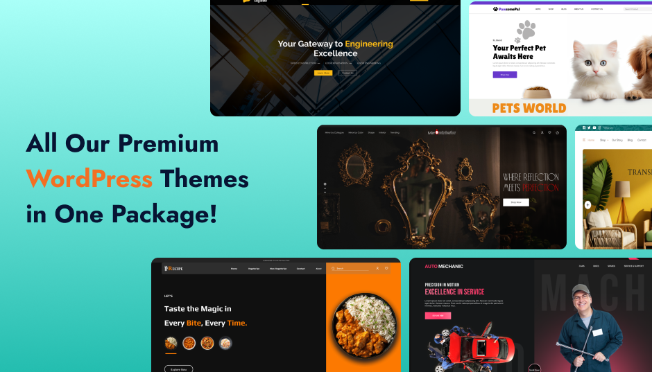
Choosing the right WP Theme Bundle ensures your WordPress site is fully responsive, performing seamlessly on phones, tablets, and desktops. A responsive WordPress website enhances user experience, keeps visitors engaged, and helps you reach a wider audience all without complicated setup. With the right theme bundle, making your site mobile-friendly becomes simple and hassle-free.
Responsive web design with WordPress means your pages look great on every device, no matter the size. This helps your site rank better and keeps users engaged. Always check for easy setup, good reviews, and regular updates when choosing a plugin. A good responsive plugin saves time and gives your website a professional look. Make sure to test how your site looks on mobile after installing any plugin. In the end, a mobile-friendly site means more traffic and better results for your WordPress site. For more resources and themes, check out.WordPress Theme Bundle to further enhance your site’s responsiveness and design.