9 Responsive Website Layout Ideas for Fast and Mobile-Friendly Websites
Today, more people browse websites on smartphones and tablets than ever before. This means your website must look good and work smoothly on every screen size. A Responsive Website Layout automatically adjusts images, text, menus, and other elements to fit different devices without affecting the user experience. A responsive design not only makes your site attractive but also improves loading speed, navigation, and search engine rankings.
Whether you run an online store, a business website, a blog, or a service-based company, choosing the right layout can increase visitor engagement and conversions. Modern website themes also include mobile optimization, flexible grids, responsive images, fast performance, and clean navigation to deliver a seamless browsing experience.
In this guide, we'll explore ten responsive website layout ideas using Creative WordPress themes designs. Each layout is designed for speed, usability, and flexibility while helping your website perform well on desktops, tablets, and smartphones.
Best Responsive Website Layout Ideas
A fast and mobile-friendly website helps visitors enjoy a smooth browsing experience on any device. Choosing the right layout improves website speed, user engagement, SEO performance, and overall accessibility, making your site more effective for both users and search engines.
1. Storefront Layout

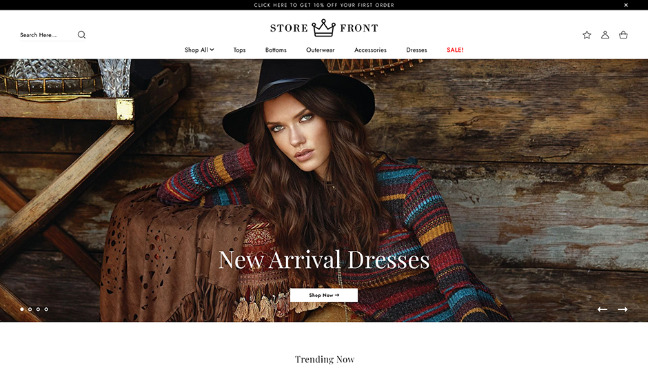
The Storefront WordPress theme is an excellent choice for creating modern online shopping websites that perform well across every device. Its clean homepage layout focuses on featured products, promotional banners, categories, and easy navigation, making it ideal for businesses looking to improve customer shopping experiences. The homepage remains organized even when viewed on smaller mobile screens, ensuring customers can browse products without unnecessary scrolling or clutter.
This layout emphasizes fast page loading, responsive product grids, flexible image scaling, and simplified navigation menus. Product cards automatically adjust according to screen width while maintaining consistent spacing and readability. Large call-to-action buttons make purchasing products easy for mobile users.
The Storefront design also supports WooCommerce integration, secure checkout pages, product filtering, wishlist functionality, and customer reviews. Responsive typography ensures product descriptions remain easy to read across all devices.
Additional SEO-friendly features such as optimized heading structure, clean coding standards, image optimization, breadcrumb navigation, and schema compatibility help improve search visibility. The layout works equally well for fashion stores, electronics, furniture, cosmetics, digital products, and multi-category online shops.
If your goal is to build an attractive online store with excellent mobile usability and faster performance, this Responsive Website Layout provides a practical and user-friendly solution that enhances both customer experience and search engine optimization.
2. Interior Design Layout

Interior designers need visually appealing websites that showcase projects without sacrificing performance. This Interior Design WordPress theme delivers a sophisticated layout that balances large images with organized content sections. Every page automatically adjusts to different screen sizes while maintaining visual consistency.
The homepage includes hero banners, project galleries, service sections, testimonials, team introductions, and contact information arranged in a clean structure. Responsive image galleries resize intelligently to preserve image quality while reducing loading time on mobile devices.
Navigation remains simple through sticky headers, collapsible mobile menus, and clearly visible call-to-action buttons. Typography also scales according to device width, ensuring comfortable reading without zooming.
The theme supports project portfolios, before-and-after galleries, service listings, blogs, pricing sections, and appointment forms. These sections can be customized to match different interior design styles including residential, commercial, luxury, and architectural projects.
Performance optimization techniques such as lightweight coding, responsive images, browser compatibility, and optimized spacing help create a smooth browsing experience. SEO-friendly layouts also encourage better indexing by search engines.
For designers who want to present their work professionally while maintaining fast loading speeds and excellent mobile usability, this layout offers a practical combination of aesthetics, functionality, and flexibility.
3. Fitness Website Layout

Fitness websites require layouts that encourage visitors to take action quickly. Whether users want to book classes, join memberships, explore workout plans, or contact trainers, the website should make every interaction simple across all devices.
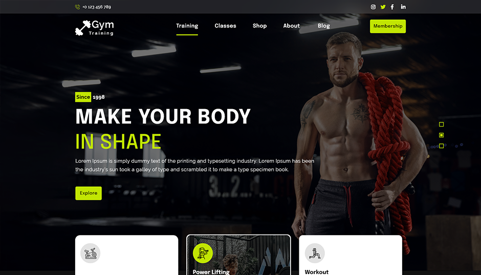
The Fitness WordPress theme features bold typography, full-width banners, trainer profiles, class schedules, pricing tables, success stories, and membership sections arranged in a clean structure. Every element adapts automatically for smartphones, tablets, and desktops.
Large buttons improve mobile usability, while optimized image sections display workout photography without slowing page performance. Responsive pricing tables stack neatly on smaller screens, making membership comparisons easier for mobile visitors.
The layout also includes sections for nutrition programs, gym facilities, online coaching, personal training, client testimonials, FAQs, and contact forms. These features help fitness businesses create complete websites without overwhelming visitors.
SEO optimization includes structured headings, optimized metadata support, fast loading pages, responsive media, and clean HTML structure. Combined with performance improvements, these features contribute to higher search rankings and improved user engagement.
Health clubs, yoga studios, CrossFit centers, martial arts schools, sports academies, and personal trainers can all benefit from this Responsive Website Layout, delivering a consistent user experience while encouraging more membership registrations and inquiries.
4. Cleaning Service Layout

Cleaning businesses need websites that build trust while helping customers request services quickly. This Cleaning Service theme offers a clean, organized layout designed specifically for local service providers. Important information remains visible regardless of the visitor's device.
The homepage highlights services, pricing, customer reviews, certifications, service areas, booking forms, and contact details within an easy-to-navigate structure. Mobile visitors can quickly access call buttons, appointment forms, and location information without excessive scrolling.
Responsive service cards automatically rearrange depending on screen size while maintaining consistent spacing and readability. Images resize smoothly to improve performance and reduce bandwidth usage.
The theme supports residential cleaning, commercial cleaning, carpet cleaning, window cleaning, sanitization services, office maintenance, housekeeping, and deep cleaning businesses. Each service section can include icons, descriptions, pricing information, and call-to-action buttons.
Performance-focused coding helps improve loading speed, while responsive navigation ensures customers easily find important information. Search engine optimization is supported through structured content hierarchy, optimized page layouts, mobile compatibility, and fast-loading assets.
Businesses looking to generate more local inquiries and provide a seamless browsing experience across all devices will find this layout practical, professional, and highly user-friendly.
5. Jewelry Store Layout

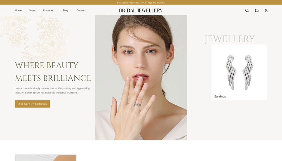
A jewelry website should reflect elegance while providing customers with a smooth shopping experience on every device. The Jewelry Store theme features a sophisticated layout that combines high-quality visuals with intuitive navigation, making it ideal for showcasing premium products such as rings, necklaces, bracelets, earrings, watches, and custom collections. Every section adapts seamlessly to desktops, tablets, and smartphones without compromising design quality.
The homepage includes a large hero banner, featured collections, bestseller sections, promotional offers, customer testimonials, and newsletter subscriptions. Product images automatically resize to fit different screen resolutions while maintaining clarity, allowing customers to explore fine details before making a purchase.
The layout also includes responsive product galleries, advanced filtering options, secure checkout pages, product comparison, wishlists, and customer reviews. Large action buttons and simplified navigation improve usability for mobile shoppers, reducing friction during the buying journey.
Performance optimization plays a key role in this theme. Lightweight coding, optimized images, browser compatibility, lazy loading, and organized content help pages load quickly. These improvements also support better search engine rankings by enhancing Core Web Vitals and overall user experience.
Businesses selling luxury accessories, handcrafted jewelry, gemstones, wedding collections, or fashion accessories can rely on this Responsive Website Layout to create an attractive, fast, and user-friendly online store that encourages customer engagement and repeat purchases.
6. Online Store Layout

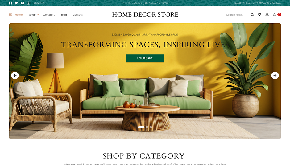
An online store needs more than attractive products it requires a layout that keeps shoppers engaged from the homepage to checkout. The Online Store theme is designed with a clean structure that highlights featured products, seasonal offers, popular categories, and promotional banners while ensuring smooth navigation across every device.
The homepage presents products using responsive grids that automatically adjust according to screen size. Whether visitors browse on a desktop or smartphone, product listings remain organized and visually appealing. Sticky navigation, category filters, search functionality, shopping cart access, and quick-view options make browsing simple and efficient.
This theme supports multiple product categories including electronics, fashion, furniture, beauty products, home décor, groceries, books, and digital products. Flexible homepage sections allow store owners to feature new arrivals, flash sales, recommended products, and customer reviews without overwhelming visitors.
Fast loading pages are achieved through optimized coding, responsive media handling, compressed assets, and SEO-friendly page structures. These features improve user satisfaction while helping search engines crawl the website more efficiently.
Integrated WooCommerce compatibility, secure payment support, inventory management, coupon systems, and responsive checkout pages make this theme suitable for businesses of all sizes. If you're looking to build an eCommerce website that balances speed, usability, and visual appeal, this Responsive Website Layout provides an excellent foundation for long-term online growth.
7. Social Blog Layout

Content creators need websites that prioritize readability, engagement, and accessibility. The Social Blog theme offers a clean and organized layout that allows readers to enjoy articles comfortably on desktops, tablets, and smartphones. Every page is structured to keep the focus on content while maintaining fast performance and easy navigation.
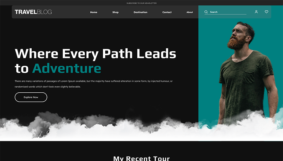
The homepage can feature trending posts, recent articles, featured categories, author profiles, newsletters, and social media integration. Responsive typography ensures that text remains readable on every device, while flexible image scaling maintains visual consistency across different screen sizes.
Navigation is designed with simplicity in mind. Mobile-friendly menus, sticky headers, search bars, related posts, and category archives help readers discover more content without confusion. Optimized spacing and clean formatting reduce distractions and improve reading comfort.
The theme is suitable for lifestyle blogs, travel websites, food blogs, technology publications, fashion magazines, personal journals, educational content, and news websites. Built-in support for comments, featured images, multimedia posts, and content categorization makes publishing efficient and engaging.
Fast page loading, structured headings, responsive media, schema-friendly layouts, and search engine optimization features contribute to better visibility in search results. For bloggers who want to attract readers while delivering a smooth browsing experience, this Responsive Website Layout offers the perfect combination of functionality, speed, and modern design.
8. Gaming Layout

Gaming websites require bold visuals, exciting layouts, and high-performance functionality to capture visitors' attention. The Gaming theme delivers an energetic design that works efficiently across desktops, tablets, and smartphones, making it suitable for gaming communities, streamers, esports organizations, gaming news portals, and review websites.
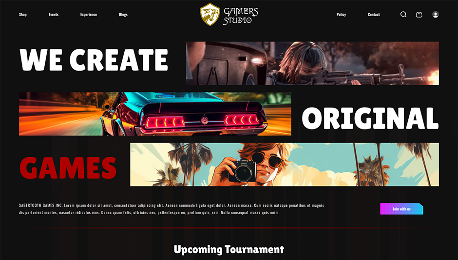
The homepage includes featured games, latest news, tournament announcements, live streaming sections, gaming videos, reviews, upcoming events, and community highlights. Responsive content blocks automatically rearrange according to screen size, ensuring an immersive browsing experience on every device.
Large visuals are optimized for performance using responsive image techniques, while organized content sections reduce clutter and improve readability. Mobile users benefit from simplified navigation menus, clearly visible buttons, and fast-loading pages that minimize waiting time.
The Gaming WordPress theme supports gaming blogs, esports teams, gaming stores, streaming channels, forums, review platforms, and gaming event websites. Flexible homepage widgets allow website owners to showcase popular games, trending articles, player rankings, and video content.
Search engine optimization is strengthened through clean coding practices, mobile-first design principles, structured content, and optimized loading performance. For gaming brands looking to engage audiences with visually impressive websites, this Responsive Website Layout provides both style and functionality without sacrificing speed or usability.
9. Pet House Layout

Pet owners appreciate websites that are welcoming, informative, and easy to navigate. The Pet House theme combines colorful visuals with an organized structure, making it an excellent choice for veterinary clinics, pet adoption centers, pet grooming salons, pet shops, animal shelters, dog trainers, and pet care service providers.
The homepage features service highlights, pet adoption sections, testimonials, appointment booking forms, featured products, team introductions, and contact information. Responsive layouts ensure these sections remain visually appealing on every screen size while maintaining excellent usability.
The theme supports service listings, pet care tips, grooming packages, veterinary consultations, pet food catalogs, online appointment scheduling, and educational blog posts. Mobile-friendly WordPress Themes forms make it easier for visitors to request appointments directly from their smartphones.
Performance optimization includes lightweight code, responsive images, efficient navigation, browser compatibility, and SEO-friendly page structures. These improvements contribute to faster loading speeds, reduced bounce rates, and better user engagement.
Businesses can customize colors, typography, homepage layouts, galleries, and content sections to reflect their brand identity. Whether you're managing a local pet clinic or a growing pet supply business, this Responsive Website Layout helps deliver an enjoyable browsing experience while supporting better visibility in search engines and increased customer inquiries.
Best Practices for Building a Responsive Website Layout
Creating an attractive website is only part of the process. To ensure excellent performance and usability, follow these best practices when designing a Responsive Website Layout:
-
Adopt a Mobile-First Design: Design for smaller screens before expanding to larger displays. This approach helps prioritize essential content and improves the experience for mobile users.
-
Use Flexible Grid Systems: Responsive grids automatically adjust columns, spacing, and content placement according to screen size, creating a balanced layout across devices.
-
Optimize Images: Compress images, use modern formats like WebP, and enable lazy loading to reduce page load times without sacrificing visual quality.
-
Improve Website Speed: Minimize CSS and JavaScript files, enable browser caching, and use a content delivery network (CDN) to improve loading performance.
-
Keep Navigation Simple: Use clean menus, sticky headers, hamburger navigation on mobile devices, and clearly labeled buttons to help visitors find information quickly.
-
Choose Readable Typography: Select fonts that remain clear across all devices. Use appropriate font sizes, spacing, and contrast for improved accessibility.
-
Maintain Consistent Branding: Use consistent colors, logos, typography, and button styles throughout the website to build trust and strengthen brand recognition.
-
Optimize for SEO: Use descriptive page titles, meta descriptions, heading tags, schema markup, internal linking, image alt text, and structured content to improve search visibility.
-
Test Across Multiple Devices: Regularly test your website on smartphones, tablets, laptops, and desktops to identify layout or performance issues before visitors encounter them.
- Monitor Core Web Vitals: Track Largest Contentful Paint (LCP), Interaction to Next Paint (INP), and Cumulative Layout Shift (CLS) to maintain excellent user experience and search performance.
Conclusion
Choosing the right Responsive Website Layout is essential for building a website that performs well on every device. Whether you're creating an online store, fitness website, interior design portfolio, gaming platform, pet care business, social blog, or service-based website, responsive design improves usability, loading speed, accessibility, and search engine visibility.
The Themes featured in this guide offer modern designs that combine flexibility with performance, helping businesses create professional websites without compromising mobile usability. By following responsive design best practices such as optimizing images, simplifying navigation, improving page speed, and adopting a mobile-first approach, you can deliver a better experience for every visitor. Investing in a well-structured Responsive Website Layout not only enhances user satisfaction but also supports long-term SEO success, higher engagement, and improved conversion rates.
By combining a high-quality Responsive Website Layout with the versatile WP Theme Bundle, you can create visually appealing, fast, and conversion-focused websites that deliver an outstanding user experience on every device while supporting long-term SEO growth and business success.
Frequently Asked Questions (FAQs)
1. How does responsive design improve user experience?
Responsive design makes websites easier to navigate, improves readability, reduces zooming and scrolling, and ensures consistent performance across devices.
2. What are the key features of a responsive website?
Important features include flexible grids, responsive images, media queries, mobile-friendly navigation, fast loading speed, and scalable typography.
3. Is responsive design better than creating a separate mobile website?
Yes. A single responsive website is easier to maintain, improves SEO, reduces development costs, and delivers a consistent user experience.
4. Can responsive websites improve conversion rates?
Yes. Faster loading times, simplified navigation, and better usability encourage visitors to stay longer and complete desired actions.
WordPress Theme Bundle