Introduction
A significant amount of web traffic in the todays digital environment originates from tablets and smartphones. A website not mobile optimized runs the risk of losing visitors, harming SEO ratings, and compromising user experience. Any company or personal brand trying to remain relevant and reachable online must know how to create mobile friendly website.
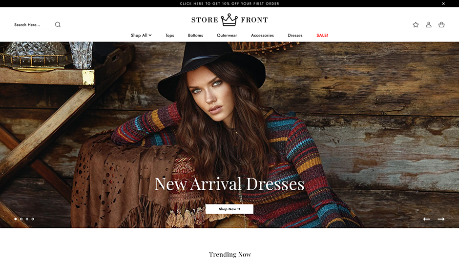
Especially with access to resources like mobile-friendly themes and plugins, WordPress simplifies the creation of a responsive WordPress site. Whether you are creating a new site or enhancing an old one, selecting the appropriate layout, structure, and theme that automatically changes to different screen sizes is absolutely vital. From desktops to smartphones, a mobile friendly WordPress theme guarantees your site looks great and works seamlessly on all devices.
When improving mobile responsiveness, think about page speed, text readability, image scaling, navigation simplicity, and general mobile usability. A responsive website that not only looks professional but also satisfies Google's mobile-first indexing criteria can be built with the correct theme and a few adjustments.
Aster Themes offers a large choice of modern, SEO-ready, and mobile-optimized WordPress themes meant to enable users create quick, practical, and aesthetically pleasing websites. Aster Themes provides the basis you need to guarantee mobile compatibility from the beginning whether your business is service-based, a blog, or an online store.
Significance of Mobile-Friendly Websites
A mobile-friendly website guarantees that your material automatically fits to various screen sizes, therefore enhancing reading, navigation, and general user experience. Users who arrive at your website and find it difficult to read, navigate, or load are probably going to leave right away, therefore increasing your bounce rate. A responsive, simple-to-use interface, on the other hand, keeps users interested and raises the likelihood of their buying or browsing your material.
Furthermore, Google ranks your website using mobile-first indexing, which means it mostly relies on the mobile version. A website that is not mobile-optimized may rank lower in search results, so impacting your online visibility and traffic. From an SEO perspective, a mobile-friendly design is no longer optional; it is a need.
Mobile optimization affects your company measures outside traffic and search ranks. A responsive design improves the conversion rate whether your website is a portfolio, blog, or online store by enabling users to take action be it subscribing to a newsletter, making a purchase, or contacting you. Ultimately, providing a professional, user-centric online experience starts with making sure your website is mobile-friendly.
Steps to Make Website Mobile Friendly
Your website's mobile friendliness is about providing a smooth and intuitive user experience across all devices, not only about resizing components. These fundamental actions will enable you to build a responsive website using WordPress:
1. Use a Mobile Friendly WordPress Theme

Starting with a mobile friendly WordPress theme is the most efficient way to go. Whether your device is a smartphone, tablet, or desktop, a responsive theme automatically adjusts the layout of your website to fit any screen size.
Aster Themes provides a large selection of responsive WordPress themes that are professionally designed, lightweight, and optimized for speed and mobile performance. Every theme is created with adaptable layouts to guarantee a consistent user experience across devices. Aster Themes has you covered with mobile-ready designs whether your website is service-based, blog, or eCommerce.
2. Use Responsive Plugins
Apart from themes, make sure the plugins you use are also mobile compatible. Steer clear of obsolete plugins that might ruin your layout on tiny displays. Search for menu plugins, galleries, forms, and responsive sliders that complement your theme and improve the mobile experience without increasing needless weight.
3. Choose WordPress Hosting that Supports Mobile Views
Mobile optimization depends much on a quick and dependable WordPress hosting company. Select a hosting provider with caching capabilities, CDN support, and good server response times. These elements taken together lower load times and enhance the performance of your responsive WordPress site on mobile devices.
4. Compress Image Size
Large photos can degrade mobile performance and slow down your site. Compress photos using image optimization tools or WordPress plugins; do not sacrifice quality. This guarantees quicker rendering on mobile networks, which are usually slower than desktop connections, as well as helps your website load faster.
5. Check Your Website Speed
Mobile-friendliness depends much on speed. Especially for mobile search, Google views site speed as a ranking element. Test your website performance using tools like Google PageSpeed Insights or GTmetrix and follow the advised guidelines to increase load times. Pages that load quickly keep people interested and lower bounce rates.
6. Use WordPress's Built-in Mobile-Friendly Features
Among the many built-in tools in WordPress core that help with mobile responsiveness are adaptive image display, block-based editing, and mobile-friendly widgets. Using the most recent WordPress version and allowing mobile previews will help you to make the most of these tools as you tailor your website.
Conclusion
A mobile-friendly website is not a luxury but rather a need in the current digital environment. Ensuring a smooth experience across all devices directly affects your traffic, engagement, and conversions as more people access websites via smartphones and tablets. Every action is crucial in creating a completely responsive website, from selecting a mobile-friendly WordPress theme to performance and speed optimization.
Following the correct techniques and leveraging the resources WordPress provides will help you to quickly turn your website into a mobile-optimized platform satisfying current user expectations. Choosing the appropriate theme like those provided by Aster Themes, which are designed with mobile responsiveness, clean design, and performance in mind starts this process. Aster Themes guarantees that your website looks good and works perfectly on any device whether you are building a professional service site, a blog, or an eCommerce store.
To preserve best mobile usability, keep your site current, use responsive plugins, and regularly check your speed. Every visitor may be given a smooth and professional experience with the correct approach and reliable tools ,regardless of how they reach your website.